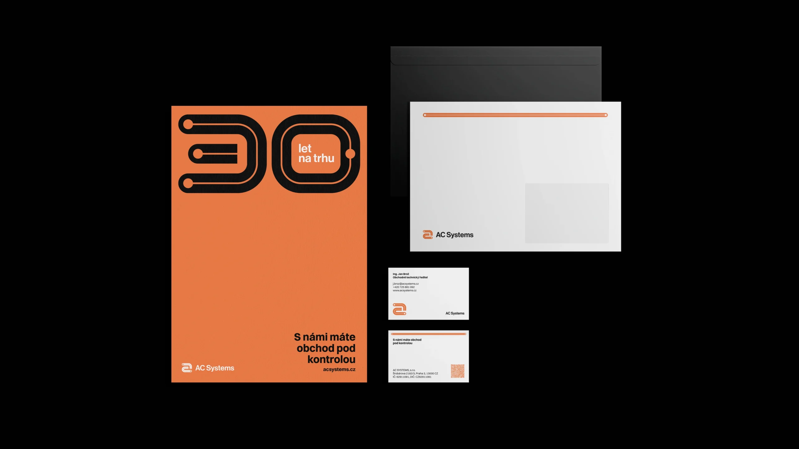
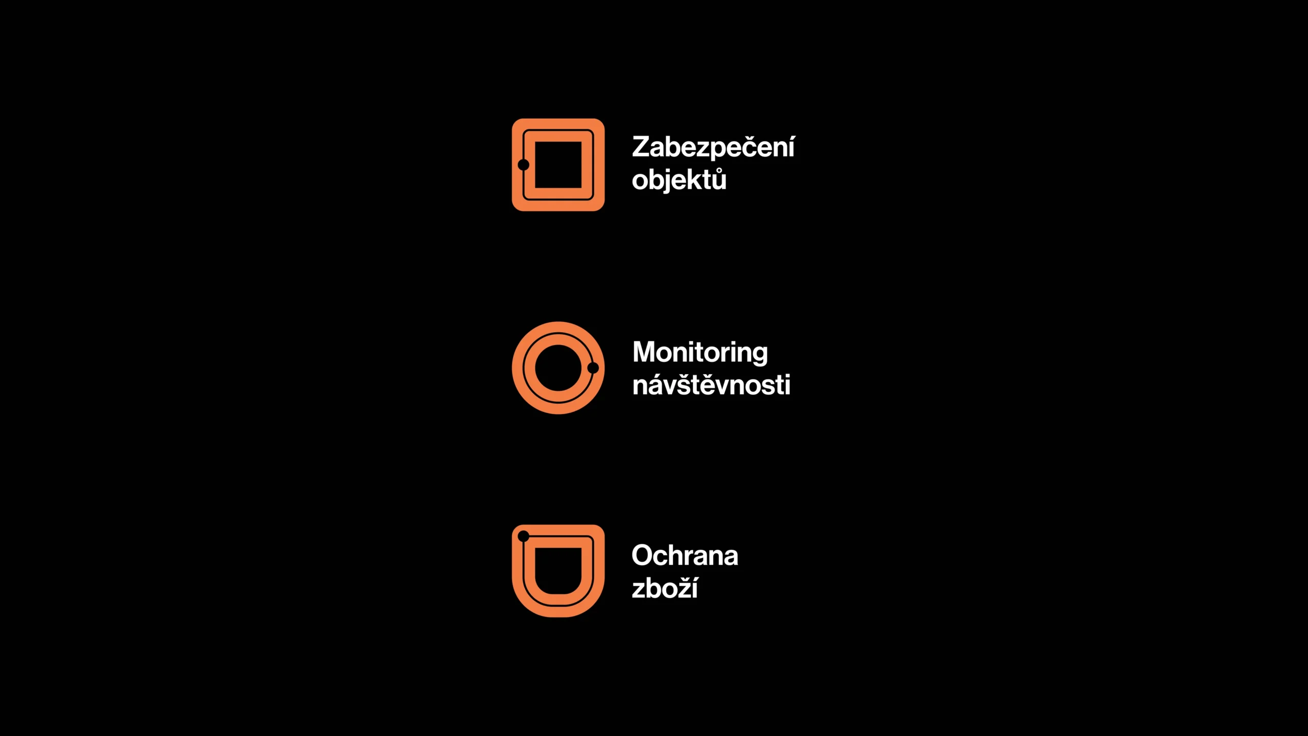
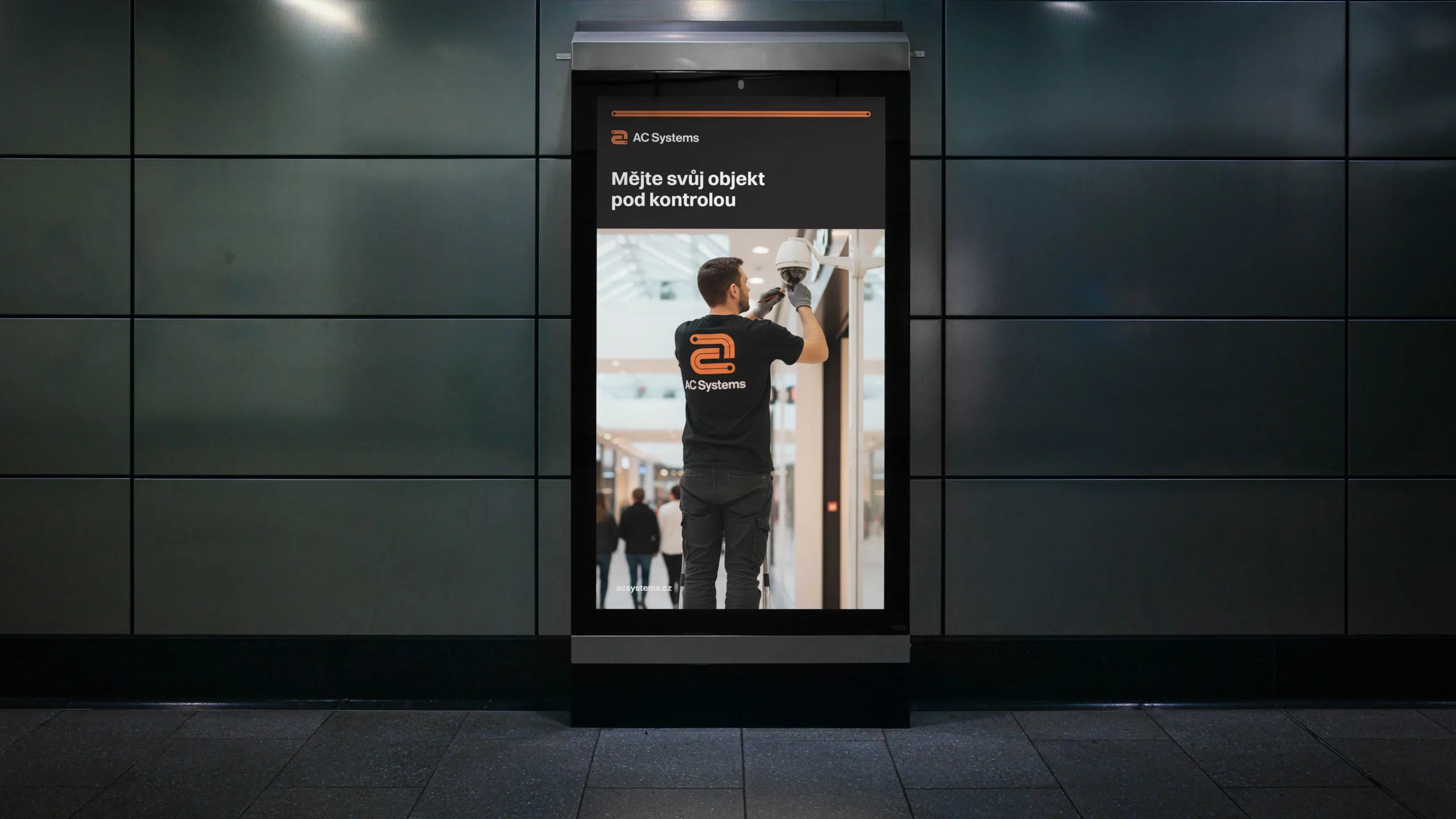
While developing the new logo, we dove into the core of AC Systems‘ products. Modern security isn’t about mechanical locks; it’s about data flow and intelligent connections. This led us to choose Printed Circuit Boards (PCBs) as our primary graphic motif.
We stylized this technical element into a minimalist form, where clean lines and terminal points symbolize stability, connectivity, and precision. The „Safety Orange“ combined with charcoal grey gives the brand the necessary dynamism while evoking the security aspect of the business.